Description
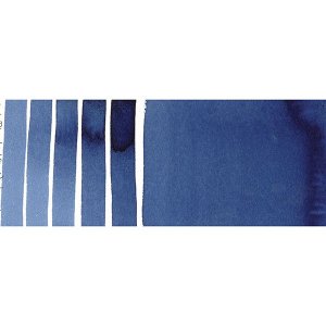
"Matisse Indigo is pure PB60 which is commonly called Indanthrone Blue which is a little confusing because the pigment is actually described as an anthraquinone. It is a vat pigment of very great lightfastness and has a reputation for being one of the most permanent organic pigments available. Even in very light tints it should not fade. In many ways it is a good cousin to Phthalo Blue for while they are not related chemically both have the very dark colour that artists need when painting but while Phthalo Blue is a greenish blue and is therefore cool, Matisse Indigo is a reddish Blue and therefore a warm blue. This means that for the first time in history artists have both warm and cool versions of a very deep dark blue of great lightfastness.
Matisse Indigo, as its name suggests is an colour like indigo but it does not have the great problem that natural Indigo suffers from - the older colour fades relatively quickly. Watercolours done in the great age of English watercolour landscapes more than 100 years ago commonly have a pinkish or ochre coloured sky. This is not because the artist made the sky that colour but because of the common practice in those days of painting skies with a mixture of natural indigo with a red or yellow ochre. With time the indigo has faded until there is now zero of the colour left, while the ochre has survived changing the appearance of the skies. Had those artists had Matisse Indigo available to them their skies would be as blue today as the day they were painted.
Because it is such a warm blue Matisse Inigo works hand in hand with Ultramarine Blue with the darkness of Matisse Indigo able to mix imperceptibly with the Ultramarine taking into shadows and getting close to black. Adding a touch of Transparent Venetian Red to that mix will produce the blackish blue colour for the deepest shadows b ut will do it in a way that makes the change in tone without changing the character of the blue. This is a very powerful advantage for the artist.
Like Ultramarine Blue, Matisse Indigo is just made for making violets, but with the difference that they can be deeper, darker, and more intense. Depending on the red chosen to mix with the violets range from rich imperious purples to heavenly dark violets. Matisse Rose Madder works well for more reddish purples but Magenta Quin Violet is a better choice for true violets. The two colours produce exquisite violets with a magenta undertone. The clarity of the mixtures are revealed when reduced with white making very beautiful clean pastel tints. These colours are significantly more light fast than violet tints made using Dioxazine Purple and should be the first choice for artworks exposed to outside light or intended to last for centuries.
Sometimes experimentation produces special surprises. Mixing Matisse Indigo with the metallic colours has some real treasures. For example, mixing Matisse Indigo with Metallic Copper gives a wonderful bronzing effect that only has parallels in nature in the feathers of iridescent birds and yet in imaginative artworks, especially abstracts the colours made from this mixture are distinctive and quite beautiful.
Matisse Indigo is an excellent choice when making greens. Mixed with Matisse Emerald it makes the sort of transparent dark bottle green that is perfect for literally painting dark green bottles. It doesn???t take many still life paintings to discover that dark green glass is relatively common in art. Getting outside into nature brings up another strength of Matisse Indigo. Mix it with Unbleached Titanium to get the sort of greenish greys commonly found in eucalyptus leaves, while mixing with Raw Sienna dark greenish grey that is perfect for the shadowing on those same leaves
Natural indigo was used from at least the earliest days of ancient Egypt all the way to the late 18th century because even though it was known to fade, artists still found that a very dark blue was


