Description
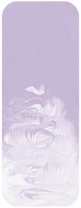
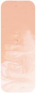
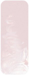
"Magenta Light is a blend of highly permanent pigments. While the colour itself has not been tested by the ASTM both ingredients have been tested individually and both are ASTM I. It is a curious colour with a fascinating history. A fashion student might call it an attractive blush pink but it has uses that go far beyond fashion and looking good.
In the early years of the 20th century scientific painting ideas became popular, especially in the United States. Published schematics of palettes used by George Bellows, Robert Henri, and others associated with Henri's art school show colour arranged mathematically according to the Maratta colour system that was in vogue in New York at the time. This was a system based on mixing all colours from primary colours and Maratta paint came in tubes with numbers and letters rather than traditional names. This colour system had its greatest strength in the beautiful harmonies possible from using the tertiary colours made by these colours. The down side of the system was that while its enthusiastic adherents happily indulged in the numerous rules about mixing triads, and calling paint by its letter and number, it was bit too much like gobbledegook for other artists and the idea eventually faded into history.
It did however seed the idea of thinking radically differently about colour in tubes and when acrylics were new in the 1960s and 70s there arose the idea of scientific painting systems in which colours would be located in logical places on the colour wheel with tints would be blended by the manufacturer much like pastels are sold with pre-made tints and shades. The reason this idea did not take the world by storm is that artists do not buy colours for reasons of mathematics and logic, they buy colours for emotional reasons plus the experience that teaches them that some colours are more useful than others no matter where on a colour wheel they are located. Look at the Matisse colour chart - the colours are there for emotional and usefulness reasons and there is nothing robotic about it. Two colours, however, survived from from earlier scientific ideas - Magenta Quin Violet and Magenta Light. Why did they keep selling while there were other colours that failed the acceptance test? Magenta Quin Violet is perhaps more obvious. There is a need for the spectrum magenta colour on the palette but Magenta Light is less obvious at first sight.
Perhaps artists like it because it is a perfect colour for two things. Firstly it behaves like an off-white. When lightening colours from cool reds to blue-violets it is often better to use Magenta Light since by having colour in it it is more gentle as a lightener than using pure white would be. More importantly though, it forms a base for mixing colours from lavender, through mauve, to soft cornflower blues. These sorts of colours are very common in nature. Not only are they the colours of the non yellow and red wildflowers, but they are the colours of the atmosphere as the day progresses. Distant hills will borrow touches of these colours in the middle of the day, and as the sun goes down these colours migrate into the sky and touch the clouds. During the last months of his life Vincent Van Gogh developed a liking for contrasts between these sort of mauves and violet, and golden ochres. This can be seen in paintings like Landscape At Auvers In The Rain where the mauve colours are full of his emotion. It is the emotion that connects us to his painting and in a more subtle and subdued way it is emotion that connects us to the colour in a tube of paint. We are no different to Vincent in that regard.
"

