Description
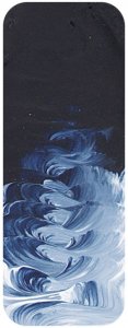
"Matisse Prussian Blue is a real wow factor colour. The reason all acrylic ranges in the early days of acrylics had Phthalo Blue as the standard dark Blue colour is that Prussian Blue was very sensitive to the alkaline environment of wet acrylic paint and so was very unstable. Prussian Blue was an industry standard but there had been little development work done on the colour for over a hundred years and that didn???t matter to those who made it because the colour was still selling well. it didn???t help that some grades were poorly made; after all, some manufacturers reasoned, a lot of this colour is going to end up in laundry products and quality is not an issue in that case. This casual attitude extended to some unscrupulous artists materials manufacturers and so it was no wonder that Prussian Blue was gaining a spotty reputation during the mid 20th century. That was a pity because when well made, it is a superb pigment.
Fast forward to a new century and Prussian Blue was really showing its age. There were more and more applications for which the old colour was no longer suitable and production was falling. To save the industry chemists started developing new varieties of the colour capable of withstanding the conditions in modern plastics and paints. These new variants were of high quality and suffered from none of the bad habits of poorly made Prussian Blue of the past century. Matisse experimented over a long period with the new varieties of the colour and Matisse Prussian Blue is the result of this exhaustive testing. Prussian Blue has many advantages as a dark blue colour on the palette and it has a colour that really shines in the crystal clear acrylic medium compared to the more greenish shade it tends to exhibit in oil. After 200 years, it has a new lease on life and it is thriving.
Prussian Blue is historically important. It was the first synthetic pigment developed in the modern era. In the ancient world there had been Egyptian Blue which was a similar but much weaker colour, but its production had ceased at the end of the Roman Empire and how to make it had been forgotten. Ultramarine Blue existed but before the 19th century it was an incredibly expensive colour made from lapis lazuli gemstones. Azurite was a good colour but it was a much lighter blue and natural indigo faded quickly. There was a need for an affordable dark blue pigment and in 1706 a German chemist named Heinrich Diesbach achieved what centuries of alchemists had failed at. He created a beautiful dark blue of high lightfastness that was cheap to make. It caused a sensation and quickly became known as Berlin or Prussian Blue because that is where it originated. Its popularity even spread to the orient and the beautiful dark blue that we often associate with Japanese prints was mostly Prussian Blue. Hokusai???s most famous work, the famous Great Wave Of Kanagawa print is an example. Back in Europe artists were inventing new colours such as Hookers Green by mixing Prussian Blue with Gamboge and generally enjoying the creative freedom the new blue was allowing.
Prussian Blue is similar to Phthalo Blue in that both are intense and very strong colours. When using either it is wise to use a little bit at a time otherwise they can overwhelm the mixture. This is a good thing because it means the colour in the tube goes a long way. Where Prussian Blue differs is that it is a denser mineral colour and therefore has more body when painting, and the colour is not so greenish as Phthalo Blue. As a general rule of thumb it is probably better to use Phthalo blue where more transparent glazing and watercolour effects are required and Prussian Blue where more opaque paint is needed.
Prussian Blue is ideal for making dark greens, blacks, and violets. Hookers Green was traditionally made with Gamboge which is a fugitive yellow. Try using Transparent Yellow Oxide to get a similar dark green colour but of great permanence. A

