Description
"In theory all colours can be mixed from just the primary colours plus black and white, or in the case of watercolour-like techniques the white is dispensed with because the white of the paper does the same job. Unfortunately the realities of real world pigments means that there will always be certain colours it is difficult to reproduce from mixing so few colours. On the other hand using just the 3 primaries plus black and white will mix a wider range of colours than using any other 5 colours on the palette thus having the primary colours available is incredibly useful for many situations. Teachers can teach basic colour theory with demonstrations that give a good idea of what the theory is all about. Secondaries and tertiaries are easily produced. colours can be mixed in the traditional way by mixing the paint before application but another possibility is the pointillist approach of applying paint as myriads of tiny dots and allowing them to mix visually in the eye. This is precisely how the four colour printing process works to produce the colour illustrations in books and magazines. The primary colours used in four colour printing are very similar to the 3 primaries made by Matisse showing what the potential is for mixing colours this way.
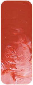
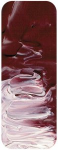
Primary Red is a clean bright red from the centre of the red part of the spectrum which is why it is so flexible for mixing the widest possible range of colours. It is made with a quinacridone pigment which in this instance goes under a violet naming convention. This is an accident of history. When this pigment was first developed it was a violet colour so it was given the designation PV19 and has gone on to be a hugely successful pigment with uses in many industries. It didn???t take long, however, for chemists to weave their magic and create a slight variation to the quinacridone molecule (chemists call these the beta and gamma forms) which produced a beautiful red colour. Paradoxically a closely related quinacridone pigment is called Pigment Red 122 but one of its most familiar uses in artists paint is as a beautiful magenta.
Quinacridone pigments are well liked by artists. The colours are pure and mostly transparent which is sometimes very desirable. For primary red it was necessary for the colour to have more body and Matisse chose this beautiful semi-transparent red version of PV19.
"

